(click for larger image)
The Davos World Economic Forum is drawing to a close. We will have to wait another year before the titans on olympus will again allow us to hear their globally significant thoughts.
Nevertheless, this year's events left us with some humourous moments. The CEO of JP Morgan - James Dimon - gave us a wonderfully self-pitying plea for the rest of us to leave the bankers alone. For me, it was the high point of this year's forum. I laughed; I cried, and I loved every moment. I hope he comes back next year. The tissues are ready, James.
Davos also left us with a few cracking pdf downloads. My favourite was The Consumption Dilemma: Leverage Points for Accelerating Sustainable Growth.
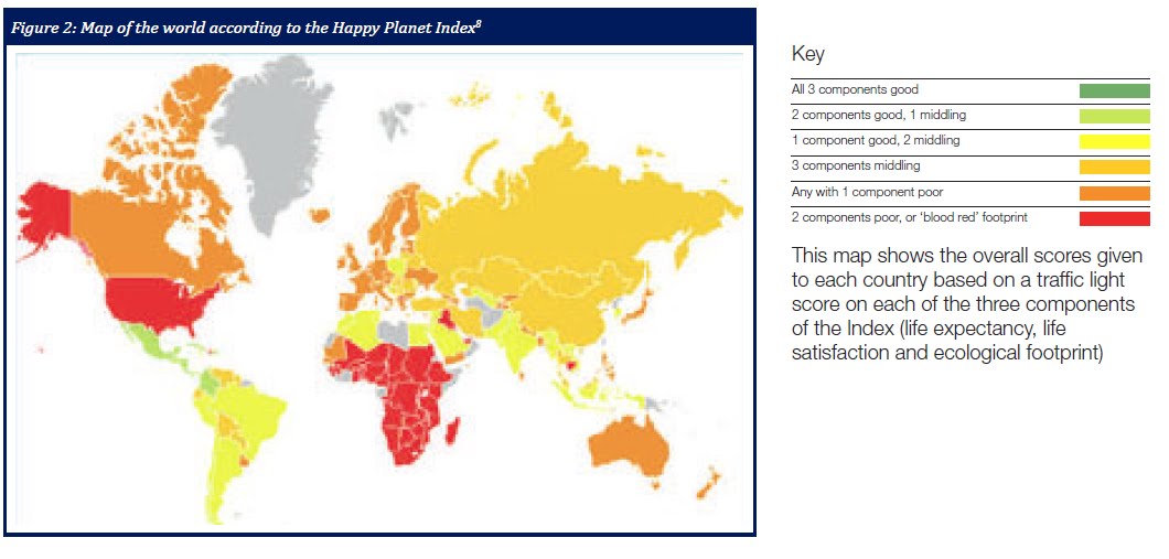
I pulled the map above from that document. It tracks the World Economic Forum's Happy Planet Index. "Above a certain level, quantitative increases in GDP no longer signify greater human prosperity. The returns of GDP growth – and its associated resource use – to well-being may fall, or even become negative."
In order to address this deficiency, the Happy Planet Index is calculated on the basis of three components of the Index (life expectancy, life satisfaction and ecological footprint).
The authors of the report claim that "countries in the developed world are often worse at delivering long, happy lives in terms of the planetary inputs that they use than some developing countries."
The conclusions from the report and the map attached abov are shocking. In terms of the Happy Planet Index, the US is at the same level as virtually all of Africa. The US also ranks lower than India and Poland. Judging by the colour coding, the happiest countries seem to be Mexico, Cuba, and Venezuela.
The UK is also in pretty bad shape, although happier than the US. We are above Africa, but on the same sorry level and Russia. We rank lower than India and Saudi Arabia.
This, of course, explains the huge population migrations from the desperate wastelands of North America towards the serene and contented lands south of the Rio Grande. Who wouldn't trade a life in New York for one in Mexico city.
5 comments:
Dear Miss Cook
A closer scrutiny of the legend against the colours reveals that red equates to:
"2 components poor, or 'blood red' footprint"
Thus the US is condemned to make the planet 'unhappy' because the assessors have deemed it to have a 'blood red' ecological footprint.
Which as any fule kno trumps life expectancy and life satisfaction in the planetary happiness handicap stakes.
DP
DP
You are right. I was dazzled by the red and the equality between the US and Africa.
Still, do you think it is meaningful?
Alice
Alice,
I thought that I read the Costa Rica was number 1 on the Happy Index.
The map is a little low on detail.
Alastair
The graphic wasn't great in the original document.
The graphic wasn't great in the original document.
Post a Comment